GRIDLOCK Dance, founded by Max Roman, is a dance company with the vision to create work that makes audiences lean forward, not sit back. GRIDLOCK's repertory of work experiments with risk, humor, and play and blurs the lines between audience and performer. GRIDLOCK dance challenges its audiences to become part of each performance, to think critically about their surroundings, and to become an active participant over passive consumer. GRIDLOCK's practices involve curiosity, conversation, and connection in order to foster work that holds a real societal impact. They treat all aspects of performance and all collaborators as an integral part of the performance, and thrive on the tension that develops at this intersection.
GRIDLOCK needed a brand that was clear, yet complicated; a brand that highlighted the tension within societies and cultures. As its name suggests, we developed a brand that serves to frame this gridlock.
Vision + Values
GRIDLOCK holds a holistic approach to dance — they treat dancers and audiences as integral parts of any work. They value diverse perspectives, and foster a community that thrives on connection. The dance company also believes in equitable and fair compensation for all collaborators, work-life balance, as well as full transparency and honesty in work.
GRIDLOCK's work is daring, works to shake up assumptions, and refuses to play it safe. At this intersection lies the "gridlock" that is foundational to the dance company. Their work is not only political, but it is human. It highlights the complexities of human nature, its nuances, and its contradictions.
Design + Identity
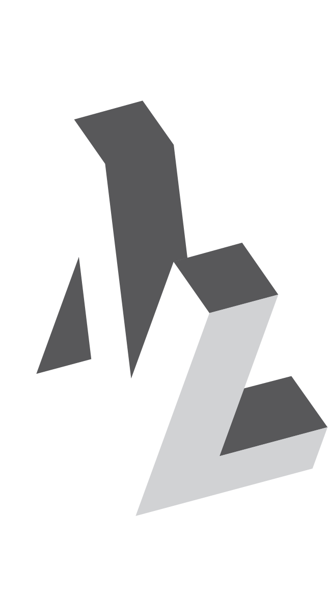
The icon and wordmark work hand-in-hand — forming a tight lockup. The abstracted "G" icon reinforces the idea of gridlock, while the expanded wordmark and thick lineweight assume a certain presence.
The identity is built from a set of basic elements: the icon and wordmark, color palette, typography, and imagery. The individual elements from the "G" are used as frames for images and graphic elements. Typography plays a central role in this identity, as it reinforces the interlocking elements of the "G" and balances tension and space within compositions. Color is used to highlight and to create dramatic backdrops for imagery.

