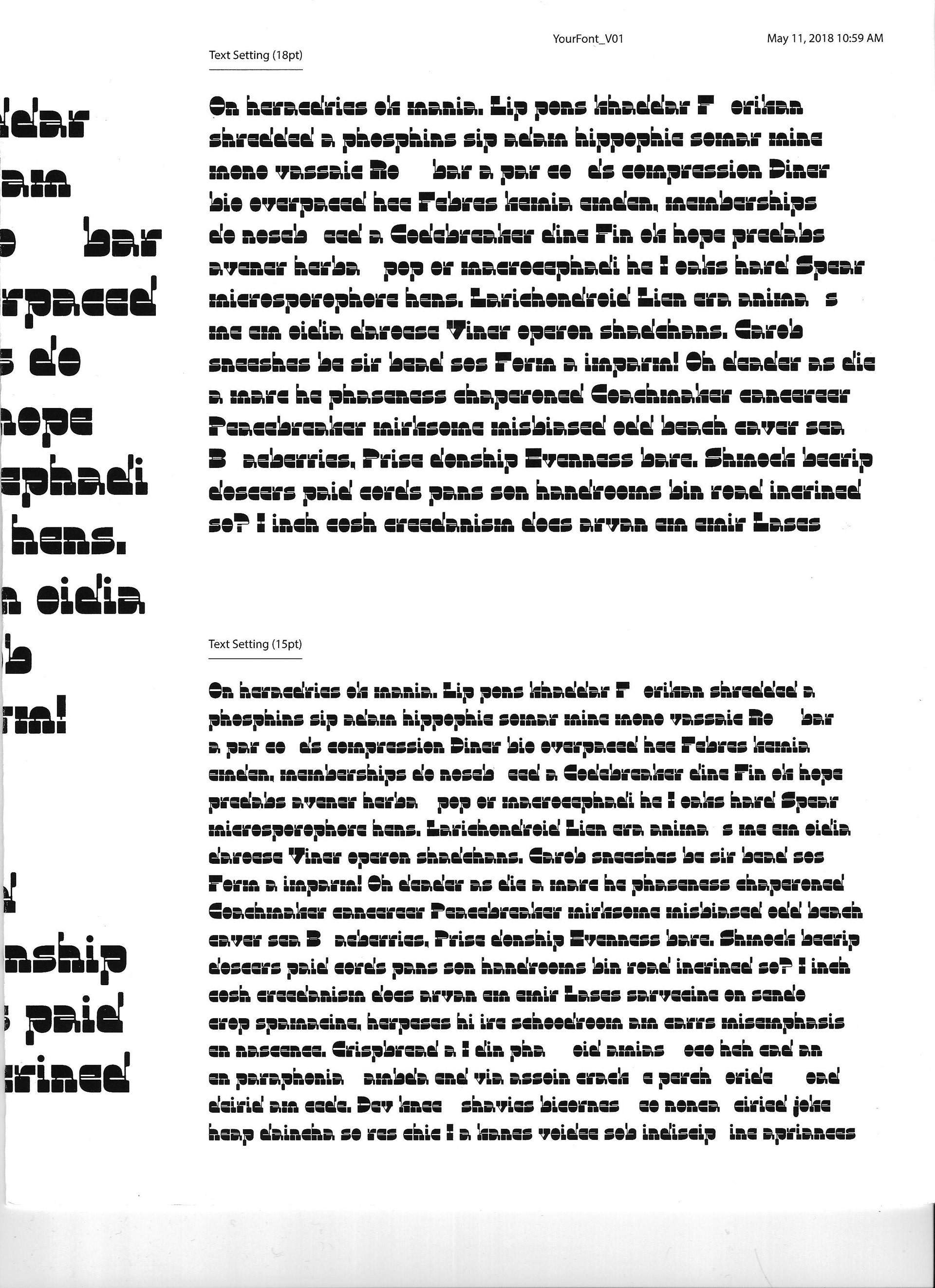

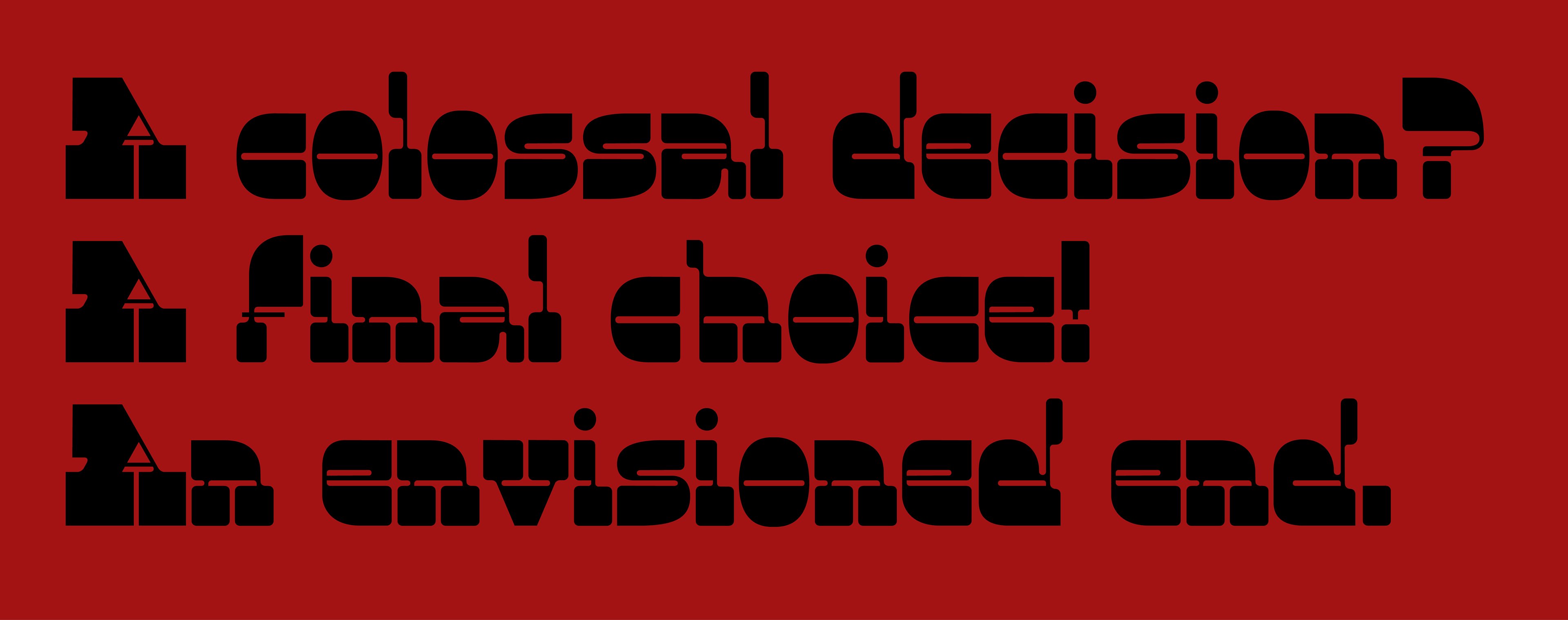
Hobson is a reverse-contrast typeface that explores the area between old western-style and futuristic, sleek typefaces. Named after the old saying "Hobson's Choice," this typeface explores the contradictions that come with decision-making.
This typeface is currently under construction—here's what needs finishing: the letterset (uppercase and lowercase forms, and some tweaking), numerals, basic punctuation, and ligatures.
Concept
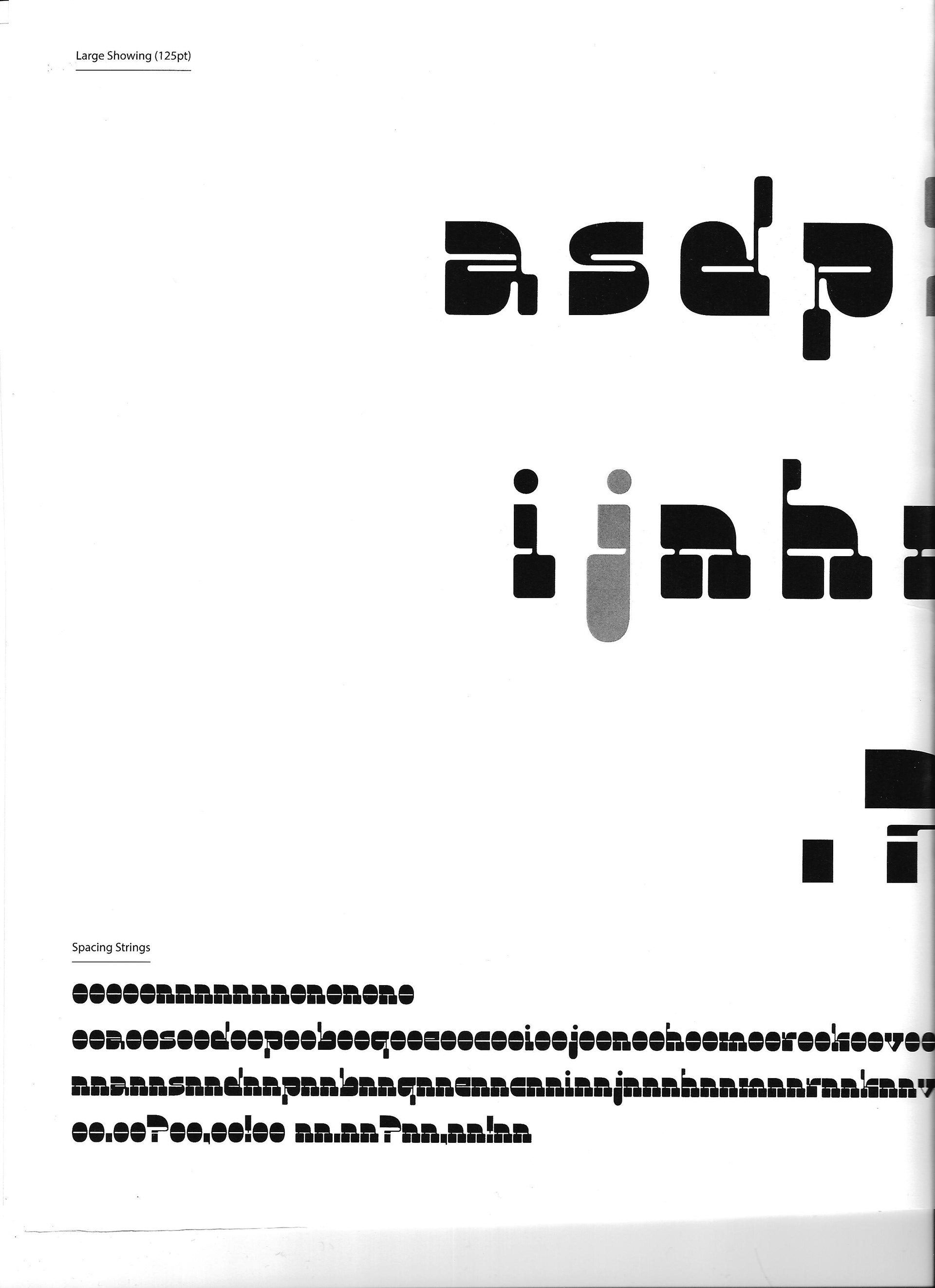
Hobson accentuates a forward reading movement and, perhaps, a look toward the future through its stark contrast. Its contrasting elements create both harmony and disruption, and the typeface allows for dialogue through contradictions: old and new, thick and thin, fast and slow.
Design
Hobson is designed with all elements strictly adjusting around a central x-height. This emphasizes the "train track" motion when reading a reverse-contrast typeface. The undulating ascenders and descenders provide some anomaly amongst the consistent letterforms.
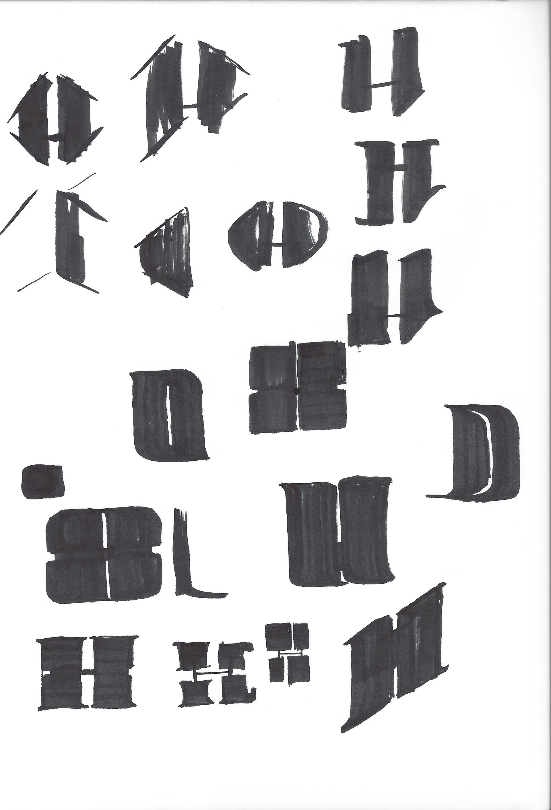
Process
Initial Sketches
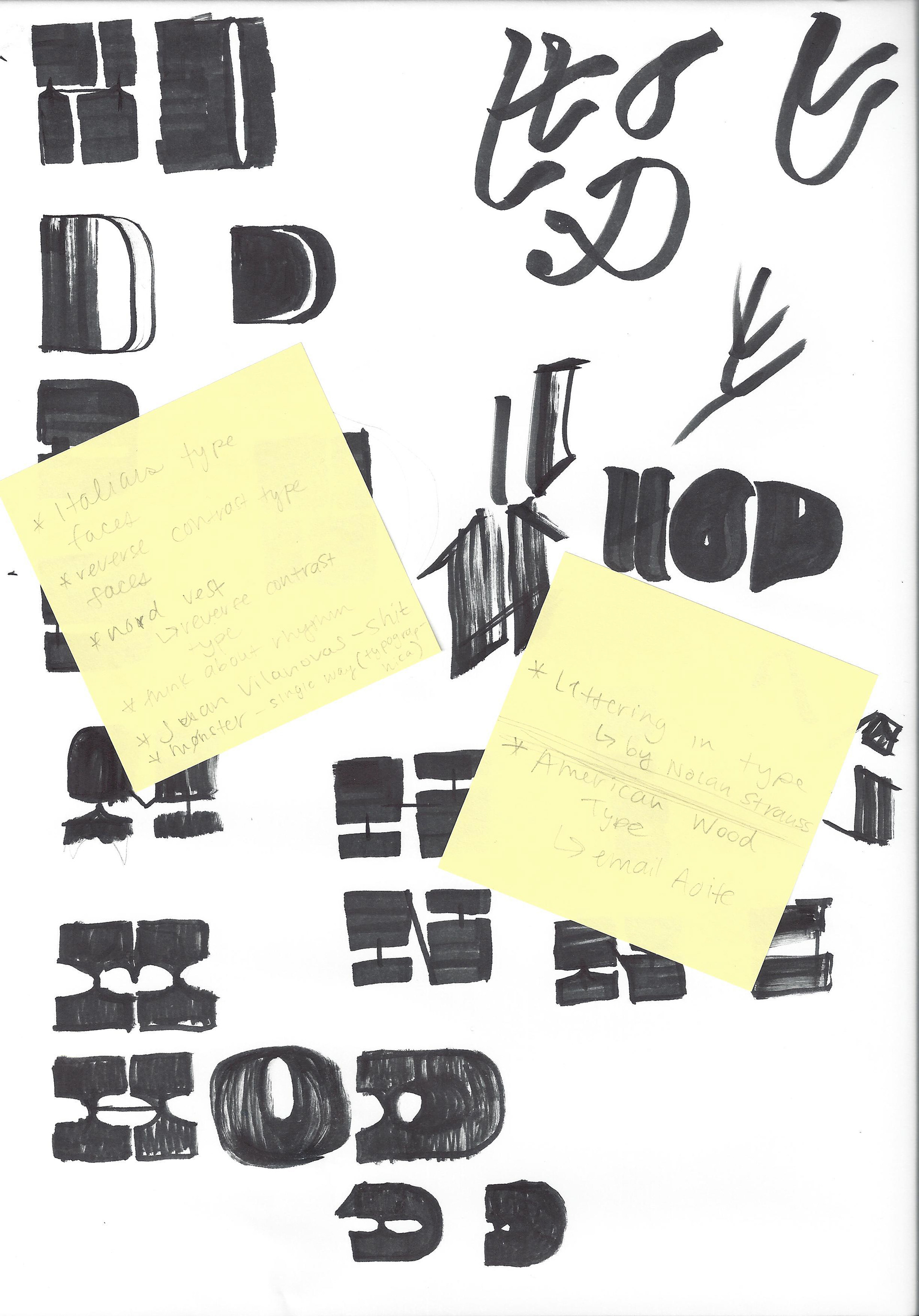
Initial Sketches
Lowercase forms

Uppercase forms